Video Production & GRaphic Design
For Gebouw-T (2021)
CASE: T-STRIJD 2021
The T-Strijd is a yearly music competition at the Dutch concert venue for amateur bands and musicians who want to kick-start their music career. In normal times, this competition would be entirely live, but during the Covid-19 pandemic Gebouw-T was not allowed to organise any events with a crowd. To still give young talent a chance to perform for a crowd, the live performances were professionally recorded, fully edited and put in to a new format, including interviews.
For the T-Strijd I created a graphic identity which was used in all the promotion material. As an intern I got the chance to act as a creative director and work in a team of professional light and audio technicians. I got the chance to give directions for the light and set up the camera’s for the recording. All the edits and animations were made by me and in addition I acted as the interviewer.
User Centred Design
ONKRUID
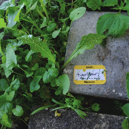
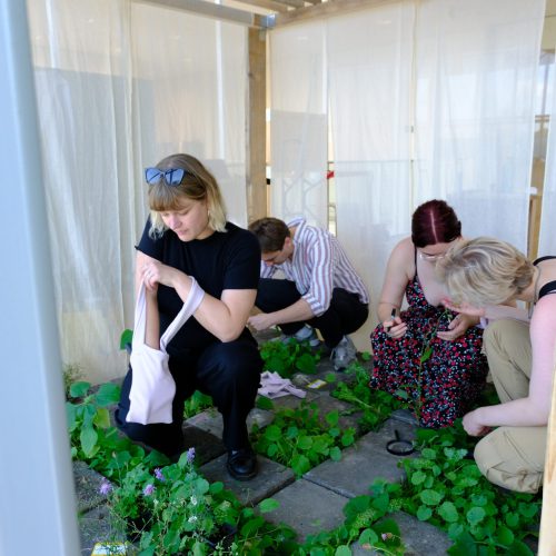
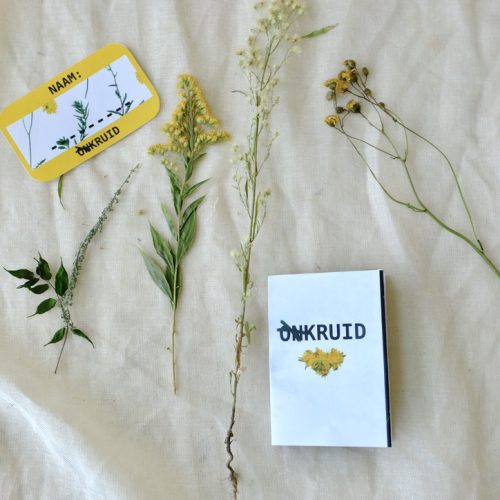
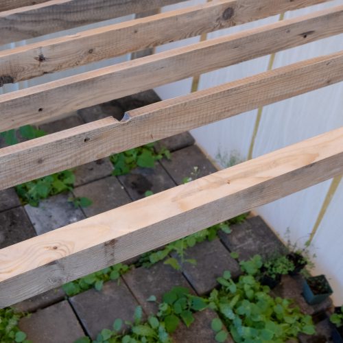
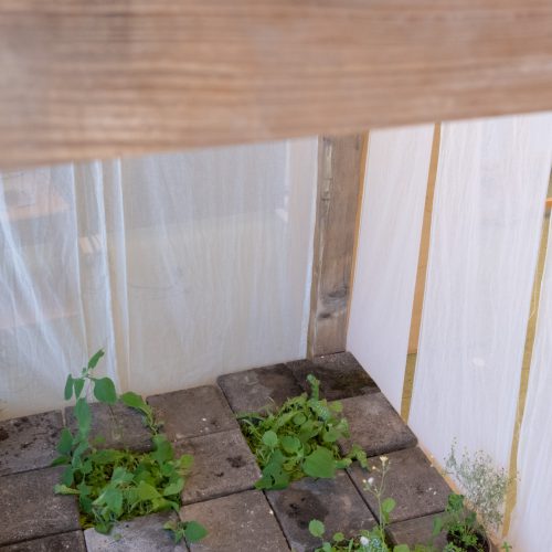
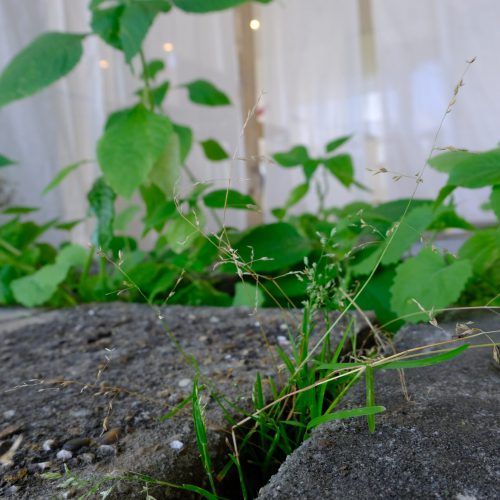
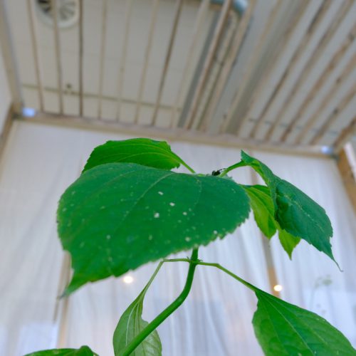
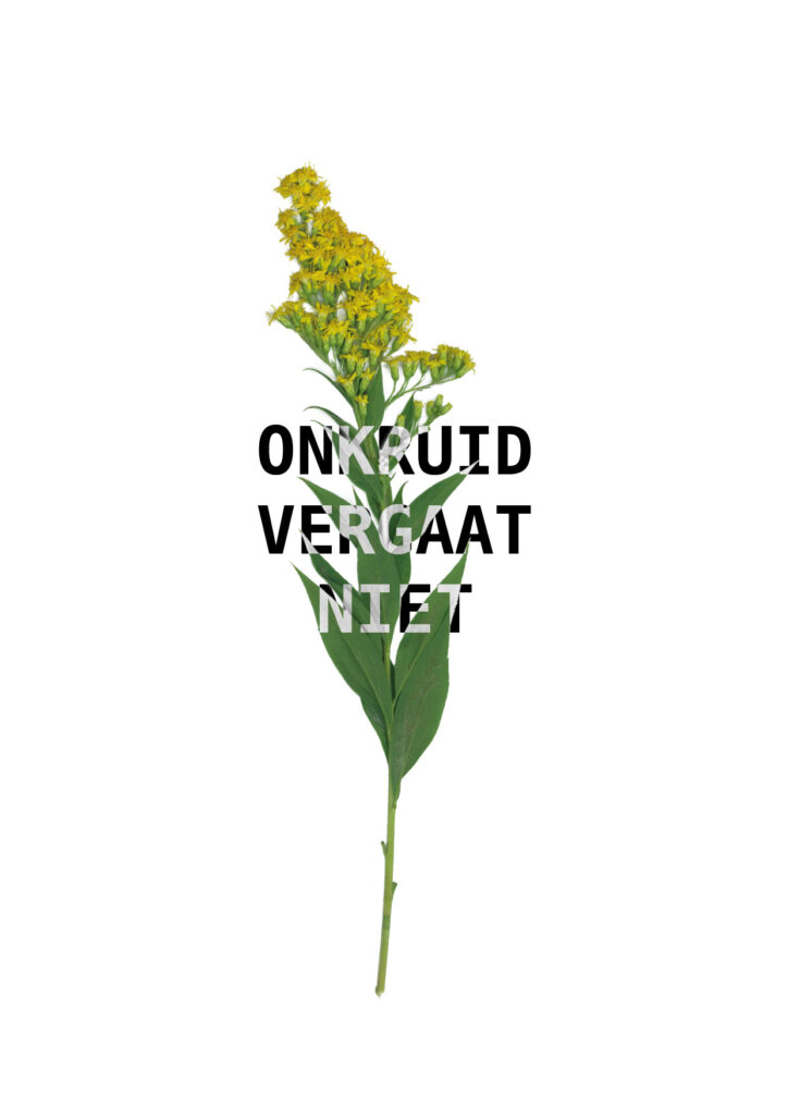
For my graduation project I spend half a year researching the connection that humans have with urban nature and in particular weeds. I wondered if there were ways to change the negative reputation weeds have and show the beauty of these urban fighters. The result was an experience center where the visitors were invited to use their senses in order to connect on a physical level with the plants.
Onkruid is Dutch foor weeds and means as much as unherb. In Dutch the name carries negativity.
Bring your old tech (2021)
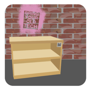
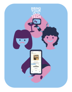
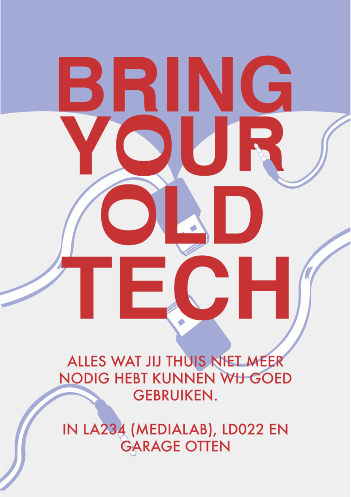
In the spirit of Date Commons we looked for a way to utilize old technology. The Bring Your Old Tech cloud is a central spot in school where CMD students can leave their old tech and possibly find some new pieces that they are able to use for their next project. The shelve was made entirely of secondhand wood and paint.
UNIFLOW (2020)
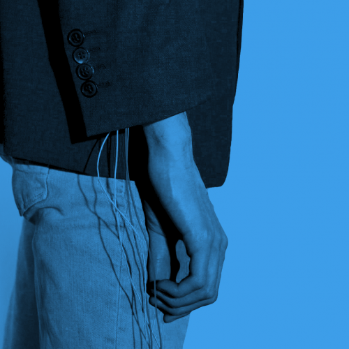
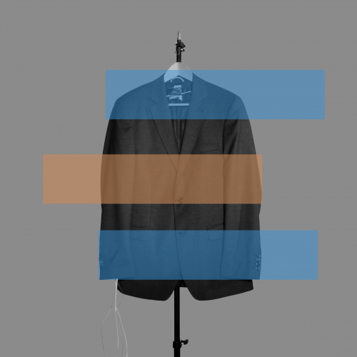
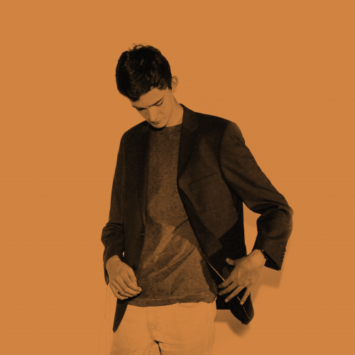
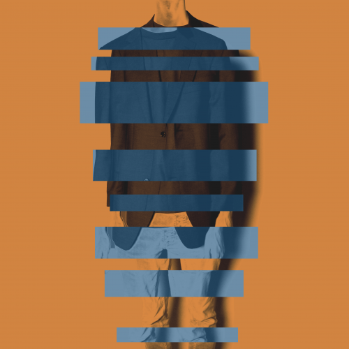
Uniflow is a suit meant for students who are forced to work at home and have trouble finding a good workflow. We researched the influence of coloured lights on the working spirit of some of our classmates and used research that was already there about the influence of clothes workers. When it is time to start working the student puts on the blazer and a blue light will set the mood in the room. When it is time for a break, the light turns to a much warmer colour so the student knows he can relax.
In collaboration with other students I finalised this project, together we tested the concept and developed it to this form. My own role was the

new paper bag (2019)
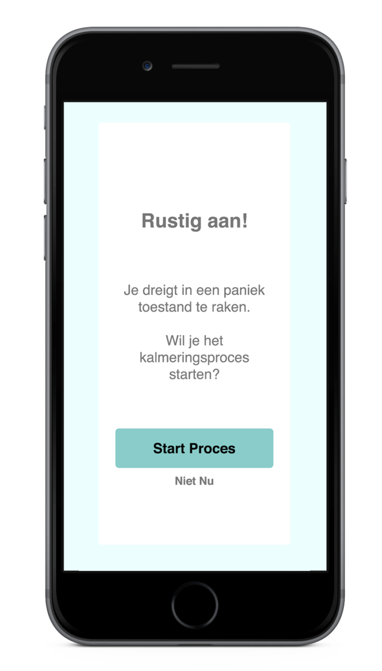
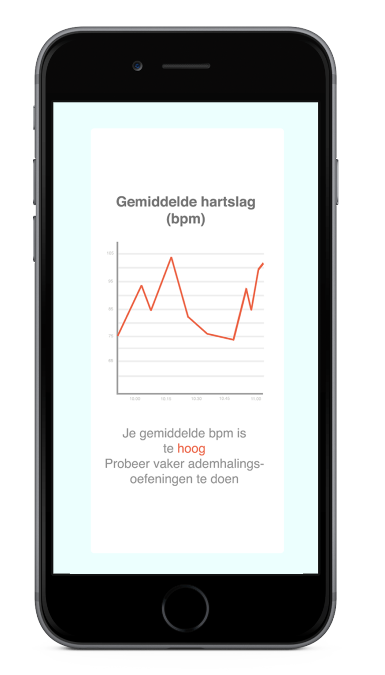
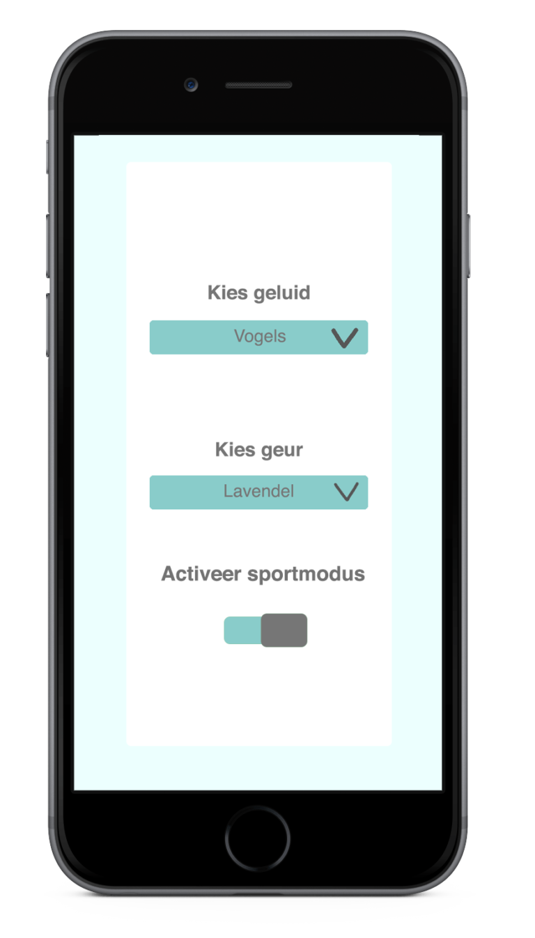
Anxiety and panic attacks can overtake at times when you least expect it. That is why I and a fellow classmate developped the New Paper Bag. It is a device that is both connected to the nostrils and ears of the user and will help them be more aware of their breathing and heartbeat. If the heart beat of the user would rise in a otherwise calm situation the system will help the user with sounds and scents. For instance, the user can listen to their own breathing and smell the scent of lavender. If the person is in therapy the therapist can add functions to the app that will help the user in times of stress.
The idea and concepts for the product (looks and user interface) were designed by me. It all started with a couple of sketches and the model on the photograph was made with clay.
Billig (2018)
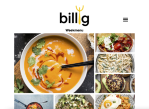
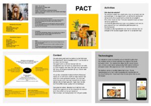
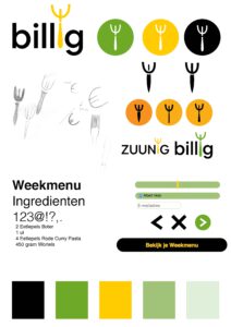
As a student it can be hard to always eat good and healthy within a budget. Billig is a website where users can sign up to receive a weekly recipe menu based on the current discounts in supermarkets. When siging up the user can give their preference for supermarket, their weekly budget for groceries and diet.
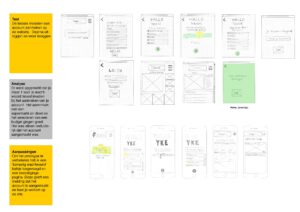
The platform was made after user centred research and made with HTML/CSS.
Design Research
The concept designs I’ve made so far are often meant speculative and with a sense of humor. My main goal is to tell a story and change people’s way of looking at an object.
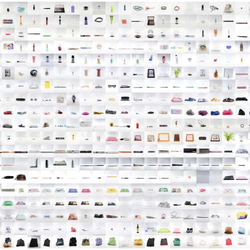
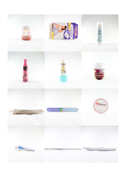
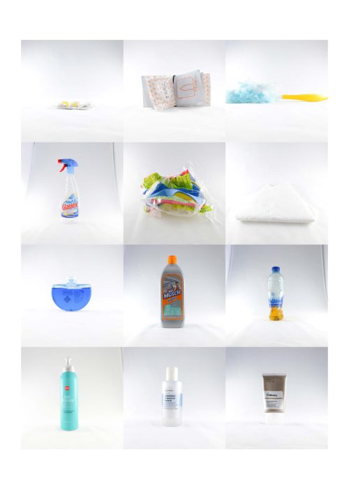
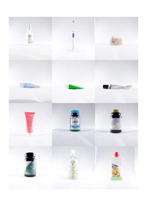
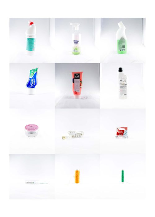
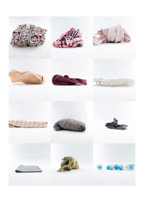
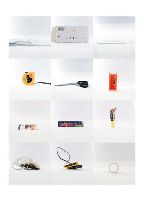
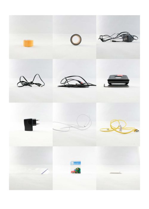
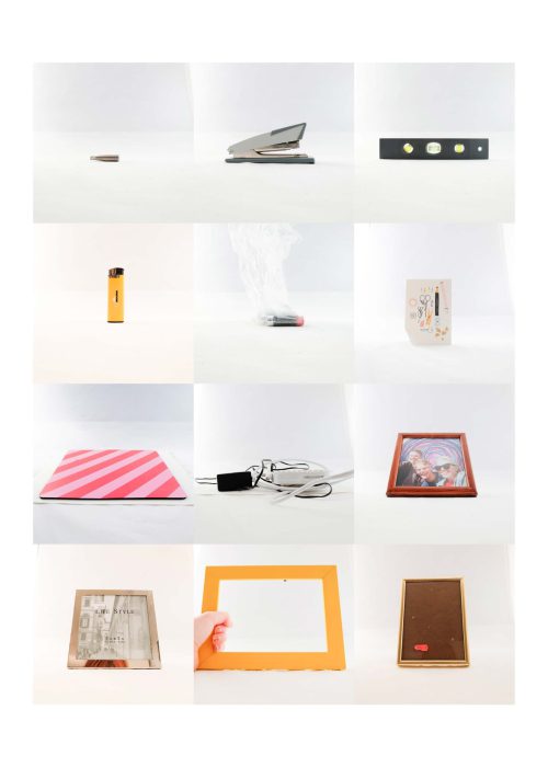
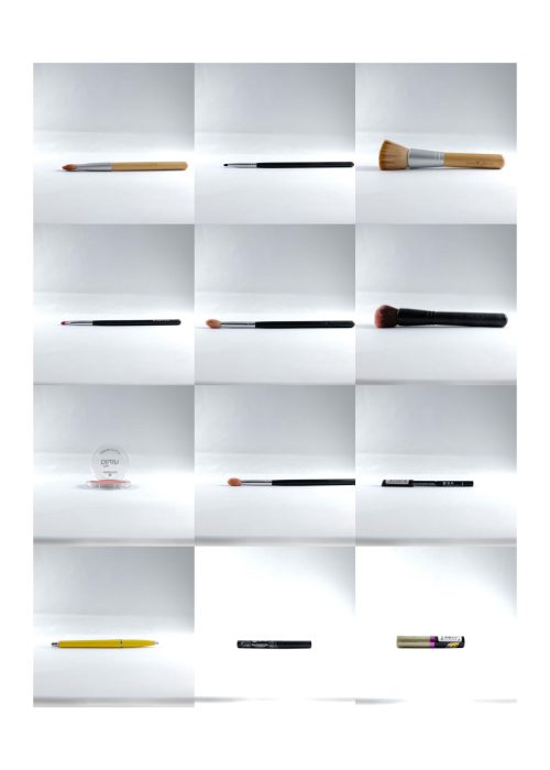
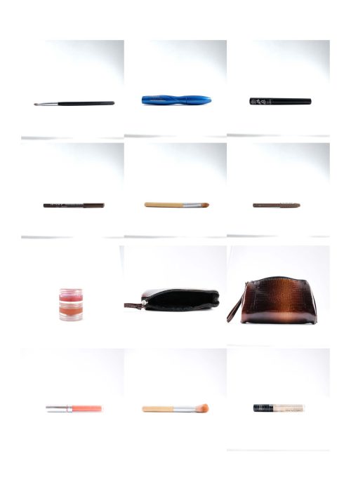
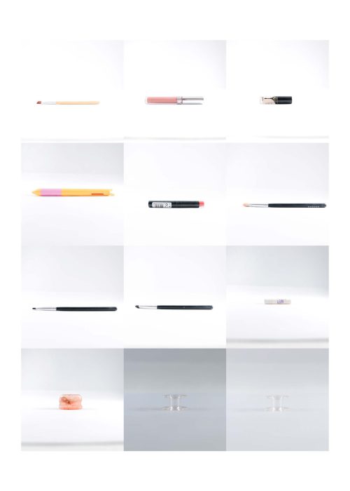
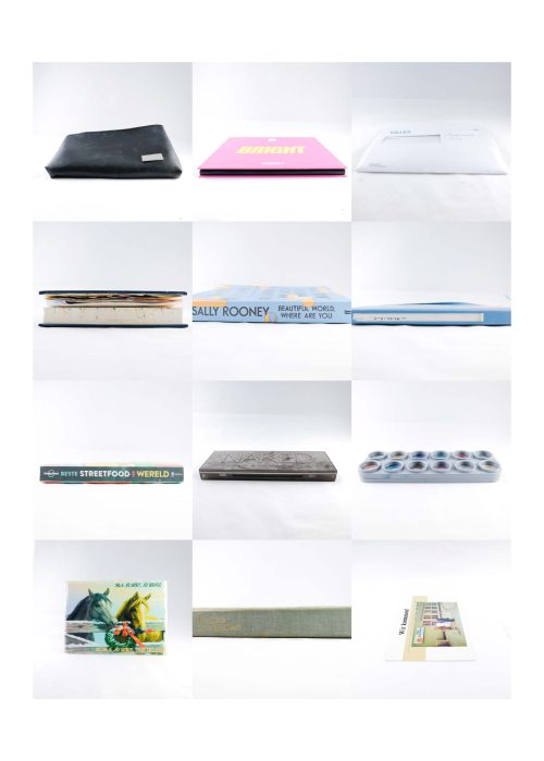
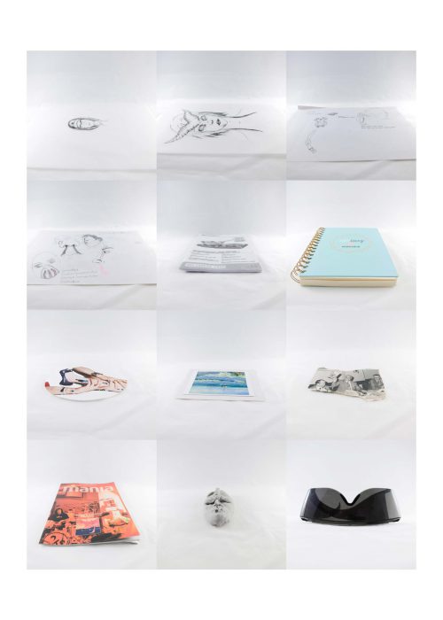
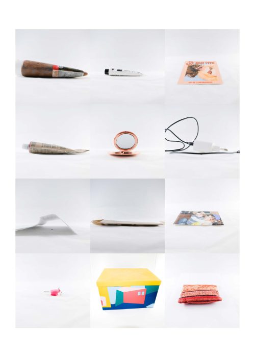
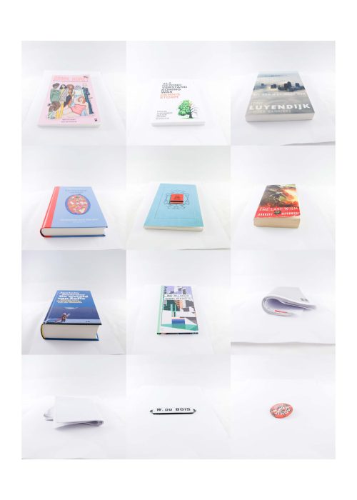
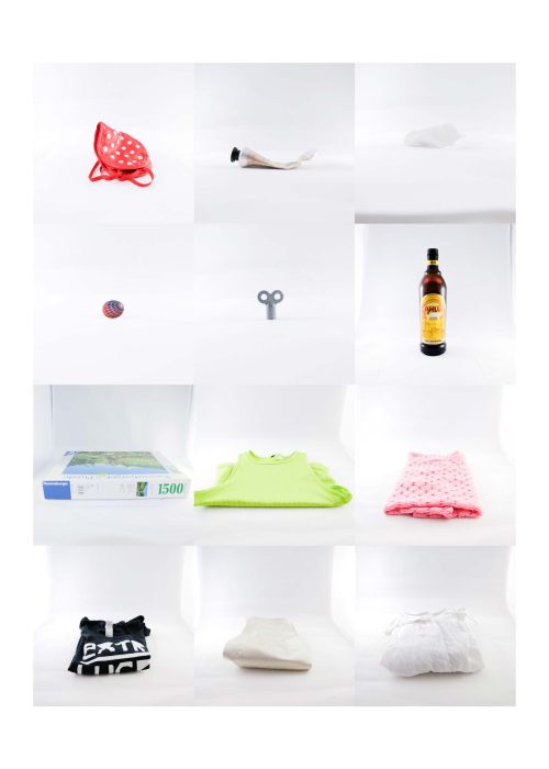
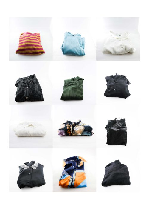
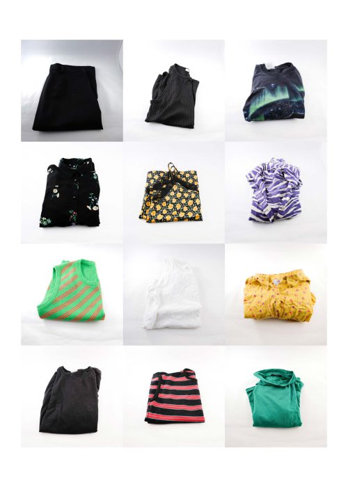
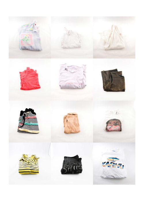
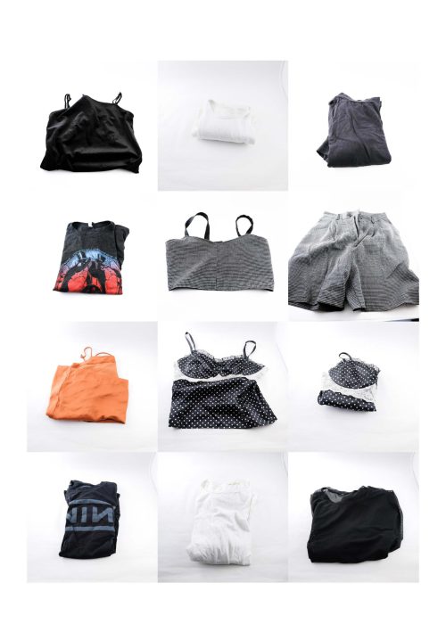
Declutter: an overview (2021)
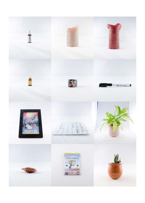
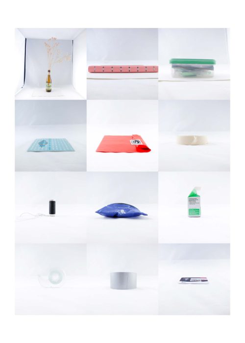
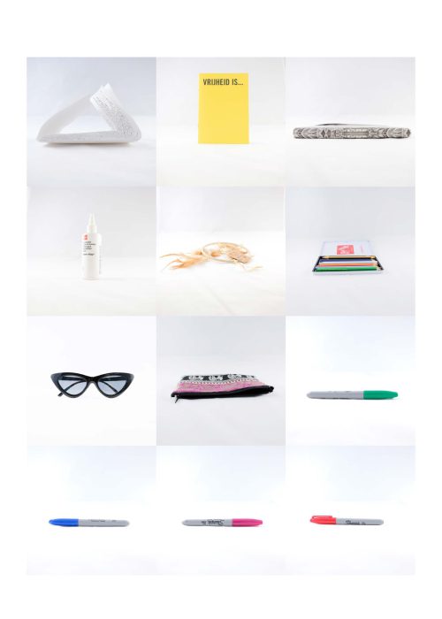
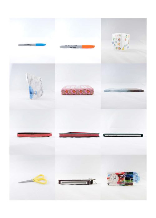
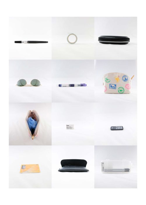
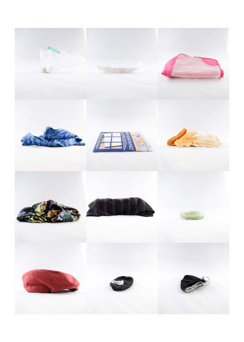
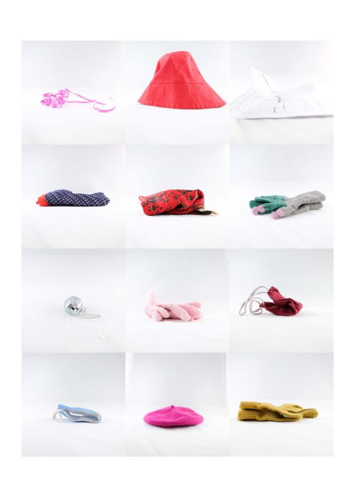
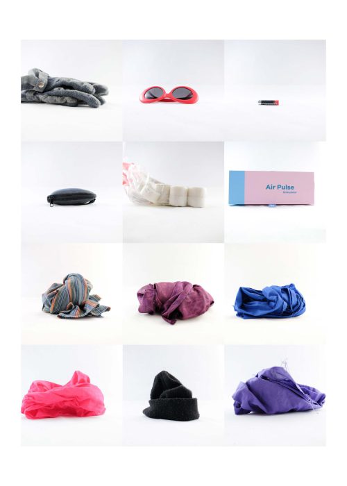
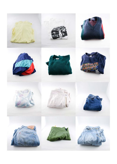
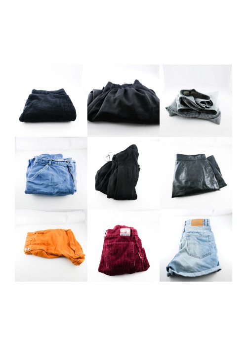
What stuff have I collected in order to create a habitat? What of these objects do use?
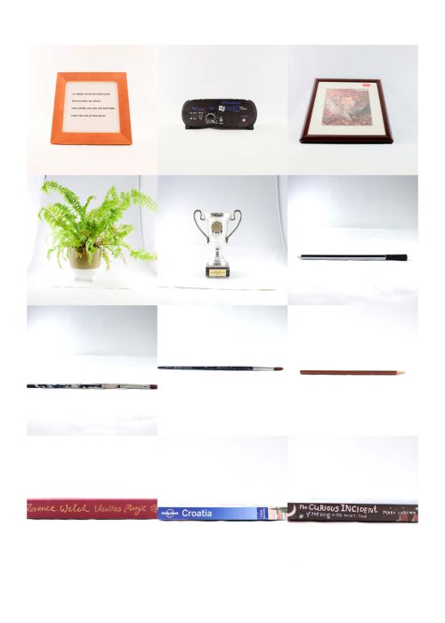
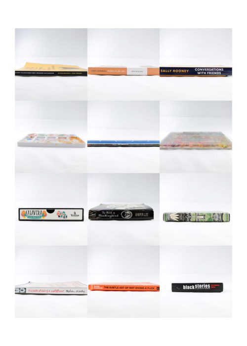
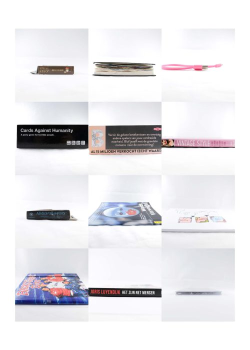
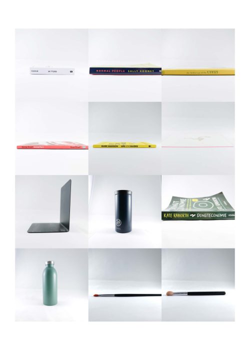
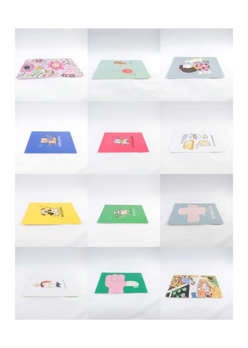
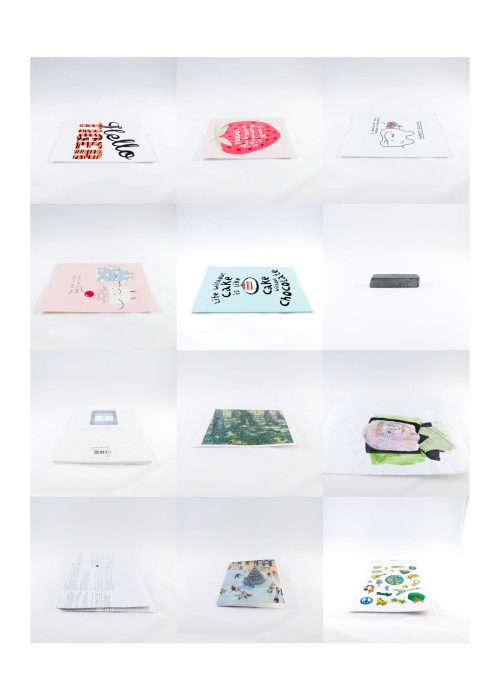
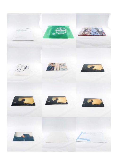
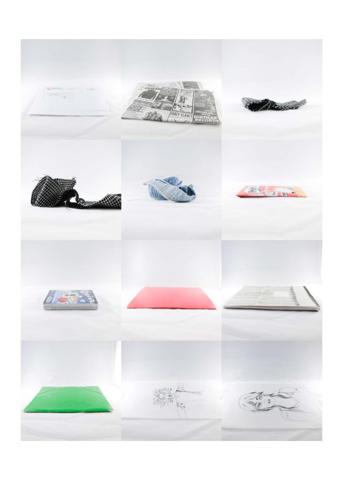
This gallery of photos is an overview of everything I once chose to take ownership of. It is an exploration of my identity and a portrait of my role as consumer. In a white, sterile environment, can the objects sketch a picture of the owner? After each picture the object was evaluated for its usefulness and sentimental value.
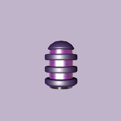
Eclipse (2020)
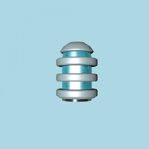
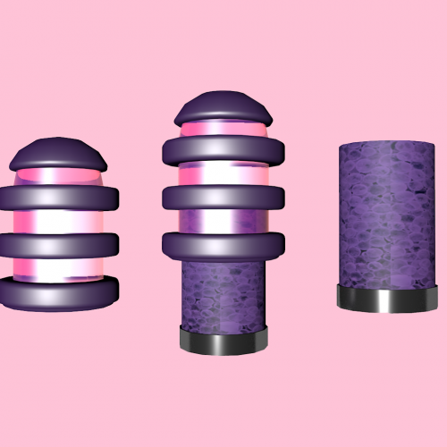
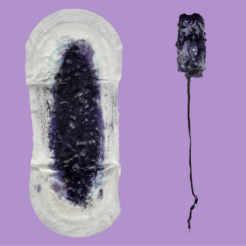
A speculative design meant as a satiric view on the women’s hygiene industry. Eclipse is a filter which can be places in the uterus and makes sure your blood smells like violets and looks like glittery cake frosting. The prototype was made in Cinema 4D and the coloured period photos were made with cornstarch, water and food colouring.
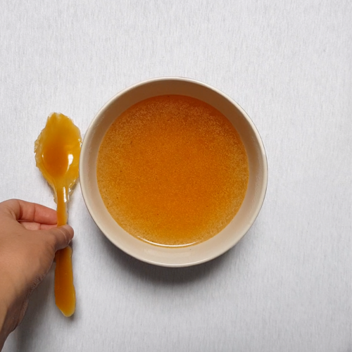
Sugarspoon (2019)
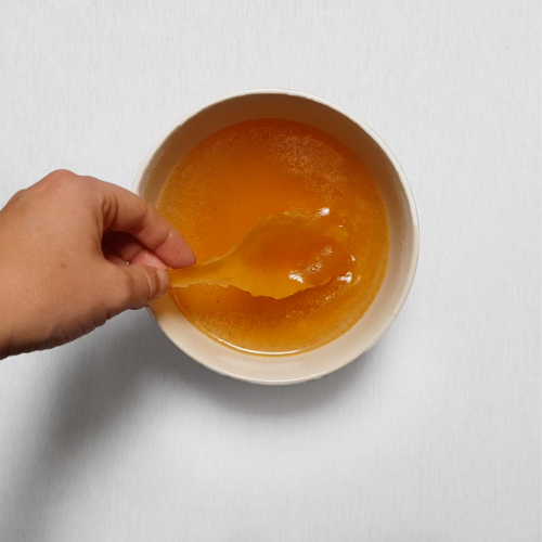
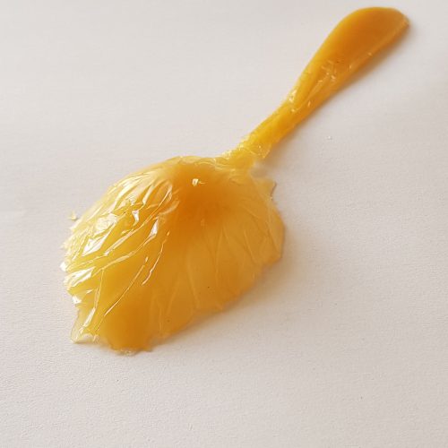
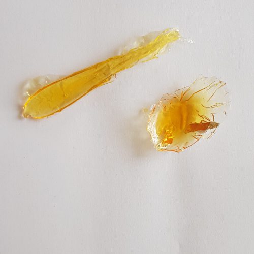
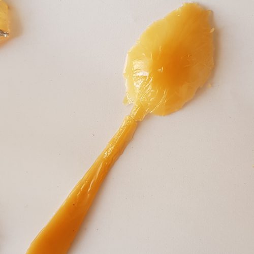
It started as an idea on how to make people uncomfortable in restaurant. What if you gave them cutlery that melts the moment it touches the hot food? Or what if you aren’t provided with cutlery at all? In a fancy restaurant there are a lot unspoken rules that are automatically applied. With this project I wanted to call out some of these rules. The spoon is made out of sugar, which is not the most ideal material when you are planning to eat a cup of steaming hot soup. The creation of the spoon didn't always go according to plan and I had to make several different recipes for the spoon to hold its shape and be sturdy enough to be held. The result was the spoon as it's shown here.
THE SLB SERIES (2019-2020)
SLB stands for studie loopbaan begeleiding which is Dutch for study traject guidance. The focus in these series, mostly lays on my own development as a person and my personal connection to shame and fear. The works are translations of the way I feel these emotions and were such great ways to think outside the box and develop myself as a designer.
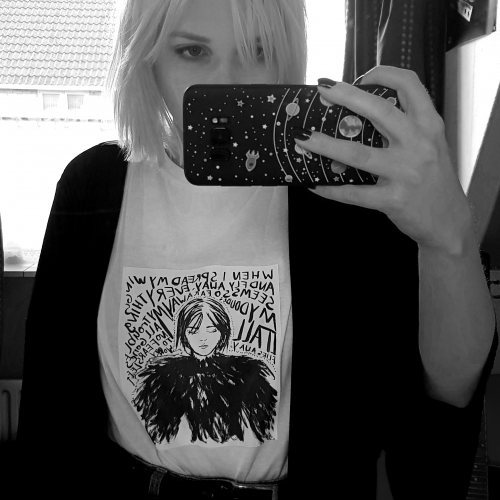
Show don’t shame (2019)
One of my biggest fears is to share my work with other people. Especially my sketches, which were made in my bedroom when I needed to clear my mind. To push myself further I printed one of my sketches on a t-shirt and wore it for an entire day at work helping costumers and to a party. I found it terrifying and every time someone complimented the shirt I needed to explain that I made it. Even the positive reactions people gave me made me feel ashamed.
So I never (2019)
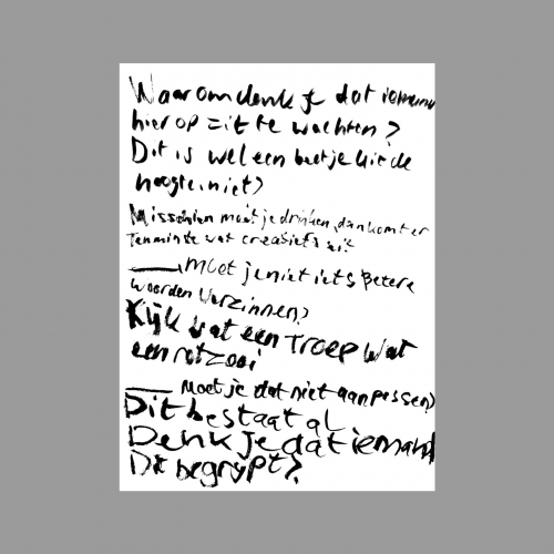
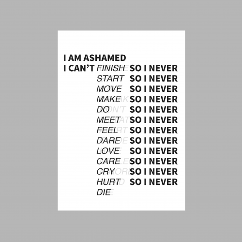
As students we were challenged to think about our flaws and obstacles when it comes to creating. I made a poster of a poem I wrote myself. Sharing my poetry is my ultimate vulnerability, I am terrified of it. To see it hanging on a huge poster in the classroom was so scary and liberating at the same time . The poem itself is about the mental process I go through every time I create something and how it's holding me back. It’s a fear based cycle full of excuses and reasons to run away, rather than to look the fear in the eye.
De realisatie (2020)
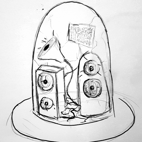
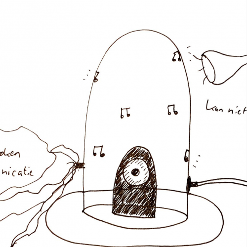
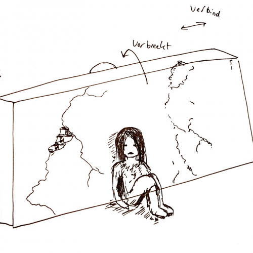
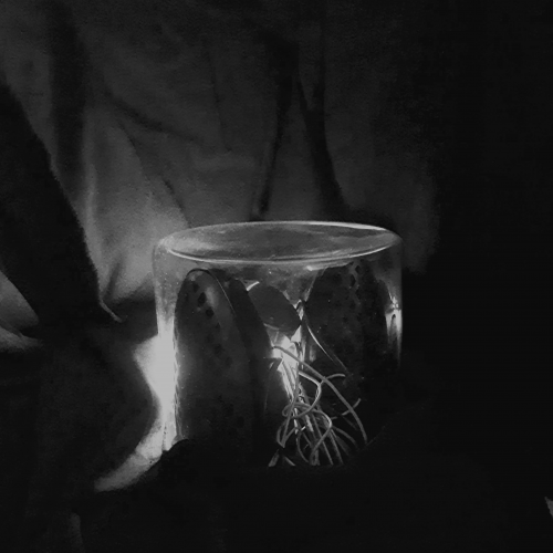
It started as an assignment about connections, I chose to start with broken connections and therefore isolation. Sketching the first things that came to my mind when I thought about this subject I eventually started thinking about a glass dome. Underneath the glass dome there is a old, messy speaker set playing my voice. I am telling a story about my fears in life and how I feel when I need to interact with other people. The title of the work is a play on derealization, which is a dreamy state of mind where I was stuck in when I was younger. The work is telling the story of that period.
GRIS (2020)
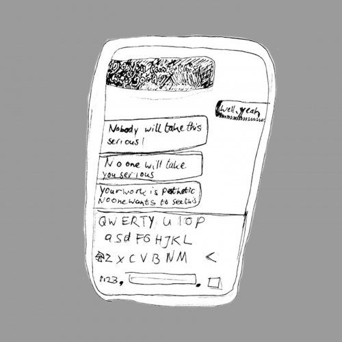
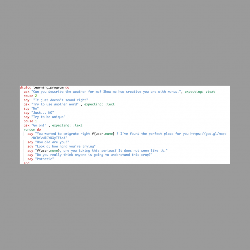
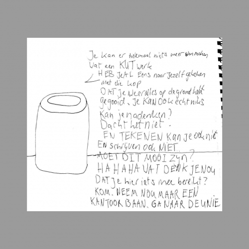
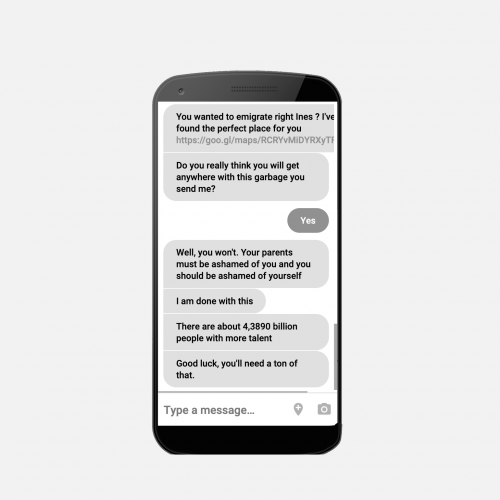
GRIS is a artistic chatbot which will help you with you artistic process. The chatbot will give you advice and ultimately diminish you on the way you work. I created this small chatbot to symbolize the self criticism a lot of people struggle with. It tears apart choices you make and is the toxic voice some people have in their head.
